Making & Modeling
Nov-Dec 2017
the orthogonal library is fractured, spilling outward like entrails.
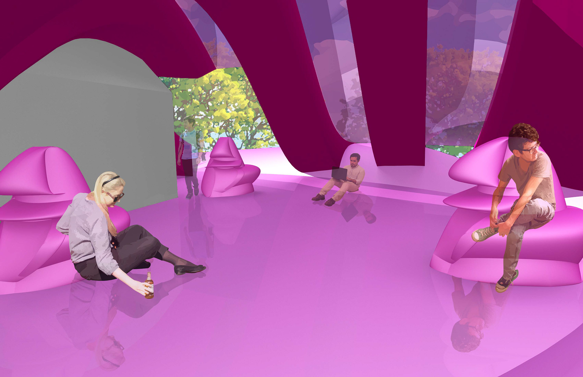
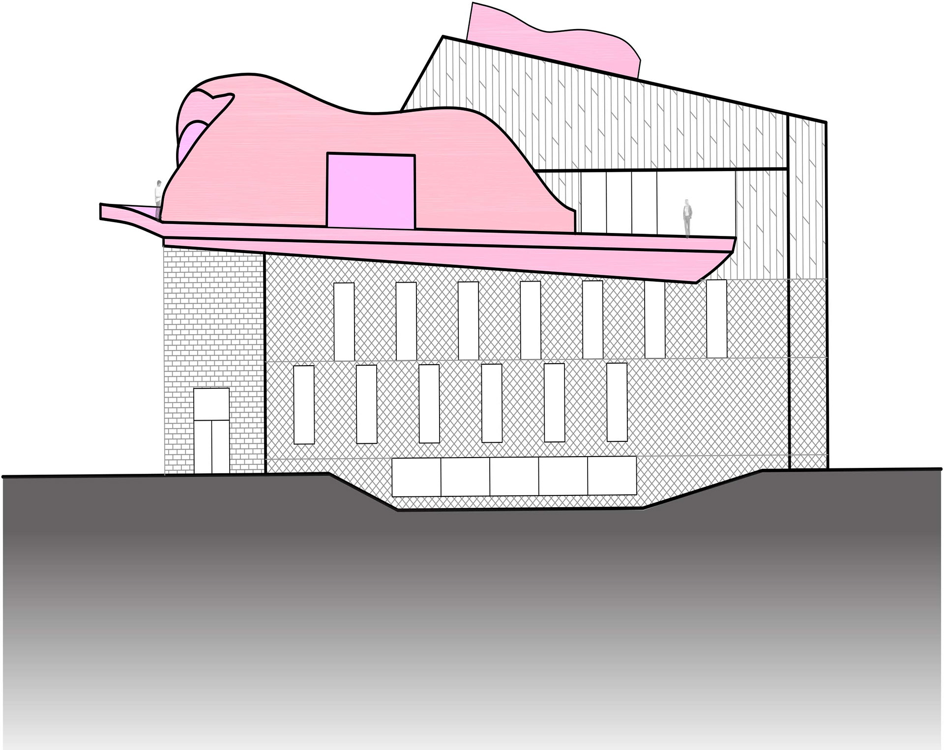
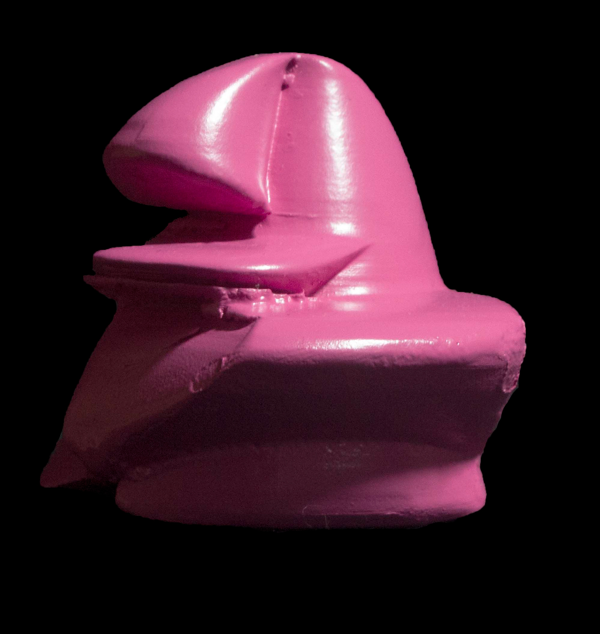
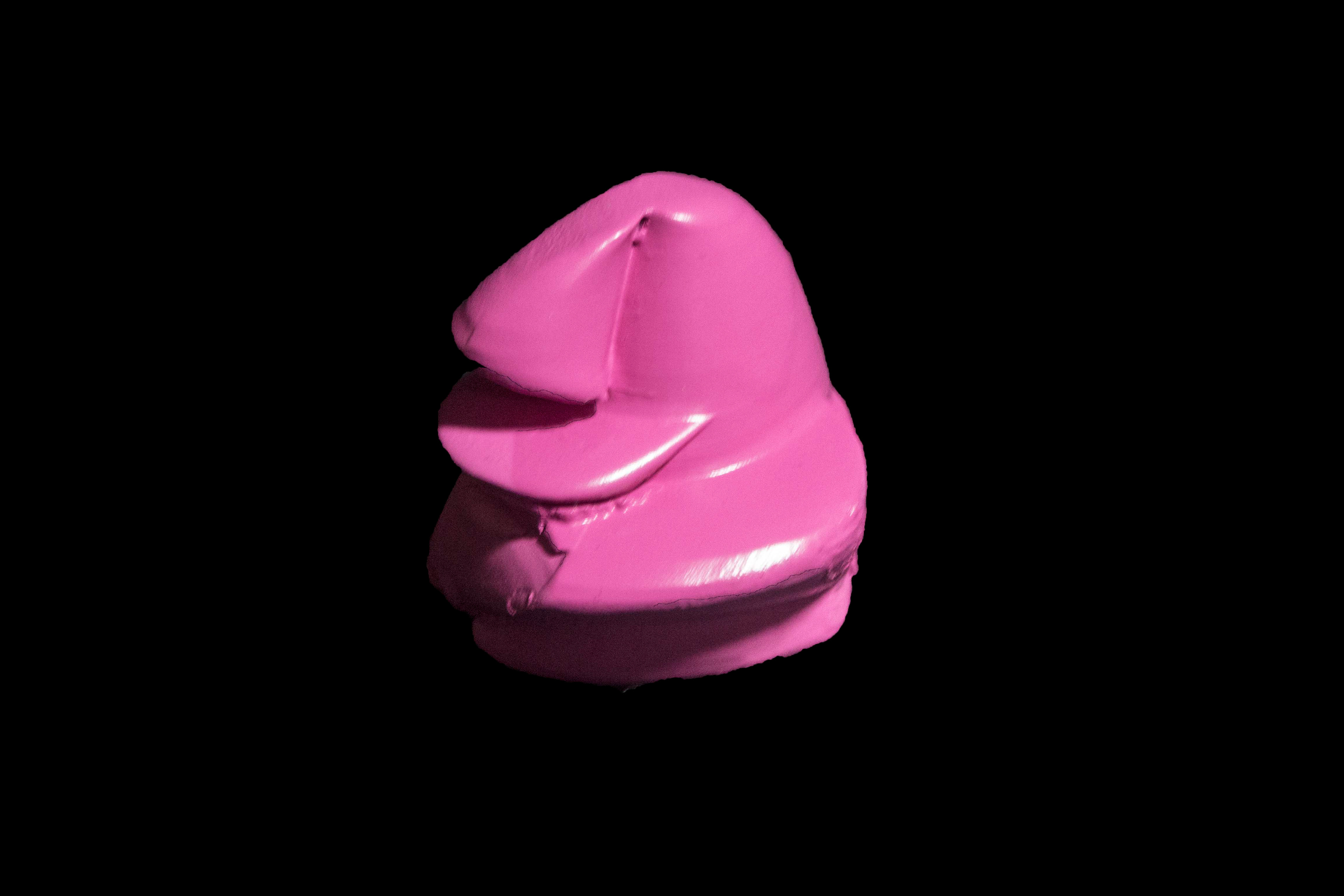
derived from random shapes created in rhino, an addition to the tozzer anthropology library creates new and unique spaces for student study and gathering outside of the traditional library’s confines. curvaceous forms stand in contrast to the rigid library. this contrast is further enforced by the employment of “millenial pink” as a unifying color for the four components: a skylight, a circulaton deck, a pavilion, and a series of chairs.
the origins of this project find their root in a collaborative design process. my classmates and i were first tasked with modeling the tozzer library, as well as four ad hoc shapes, as a method of becoming familiar with rhino, the cnc router, and 3d prining methods. during this project’s review, we were tasked with rapidly assigning meaning to each of the shapes that we all had produced. after swapping these shapes and the massing models, we were given the task of each designing the newly defined shapes into the library.
i received three rhino screenshots and one 3d printed model, which were assigned the rolls of skylight, circulation, seating, and interior space.
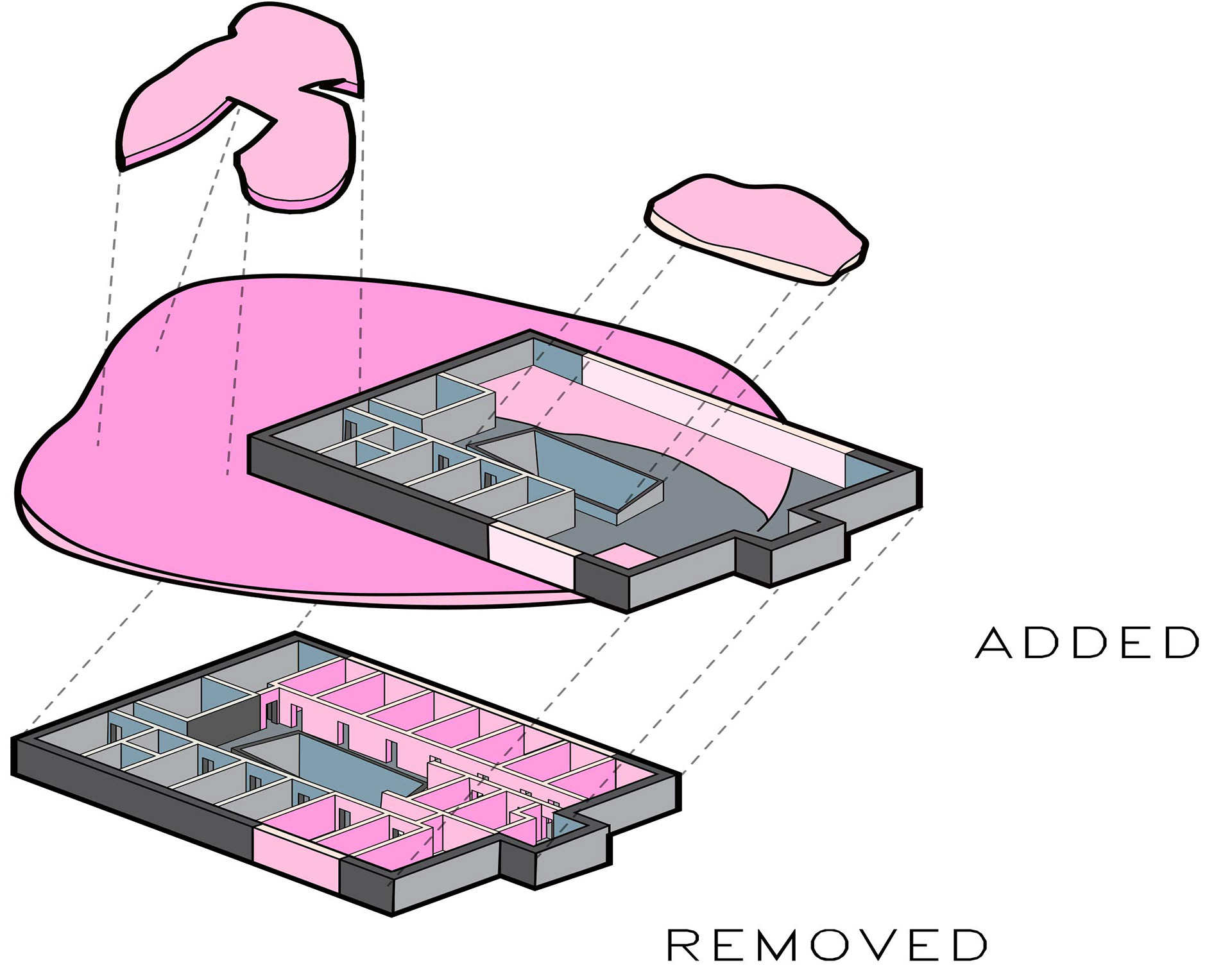
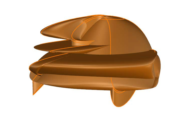
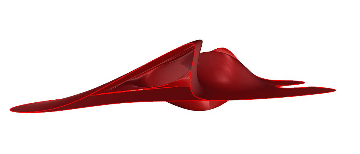
i determined to place the skylight on top of the existing atrium. before choosing the color, i wanted it to bend the light in some way to create an interesting interior display. i struggled more with finding a place for the interior circulation. i noticed that the library’s third floor was composed uniquely of offices, and that this space could be better utilized for student study and gathering. rather than limit these organic forms to the confines of the building, i determined to explode them outward, knocking out the offices and exterior walls so that a new circulation deck could be installed. the original “interior space” shape evolved into a pavilion on the library’s exterior corner.
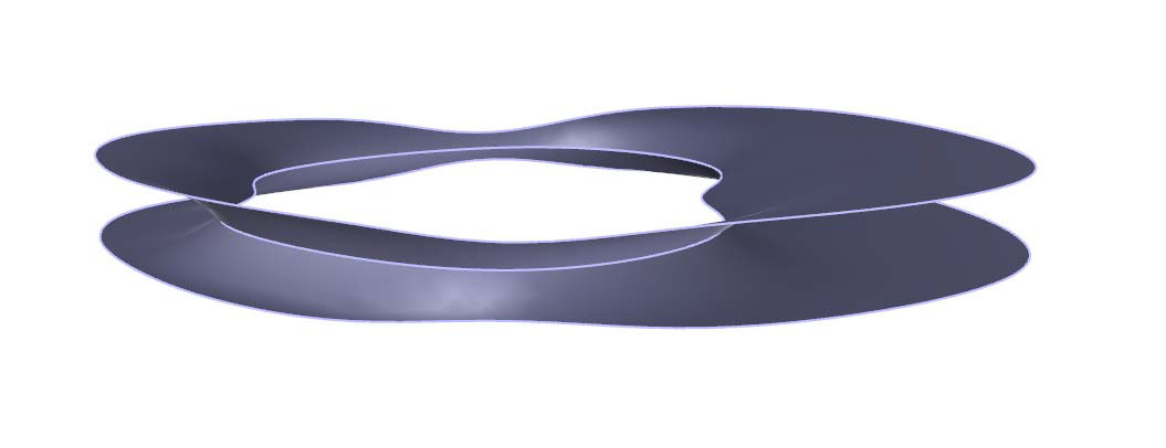
this diagram explores the relationship between the old and new third floor, as well as the addition of new elements. the orthogonal walls of the office space have melted outward, spilling like entrails out of a wound.
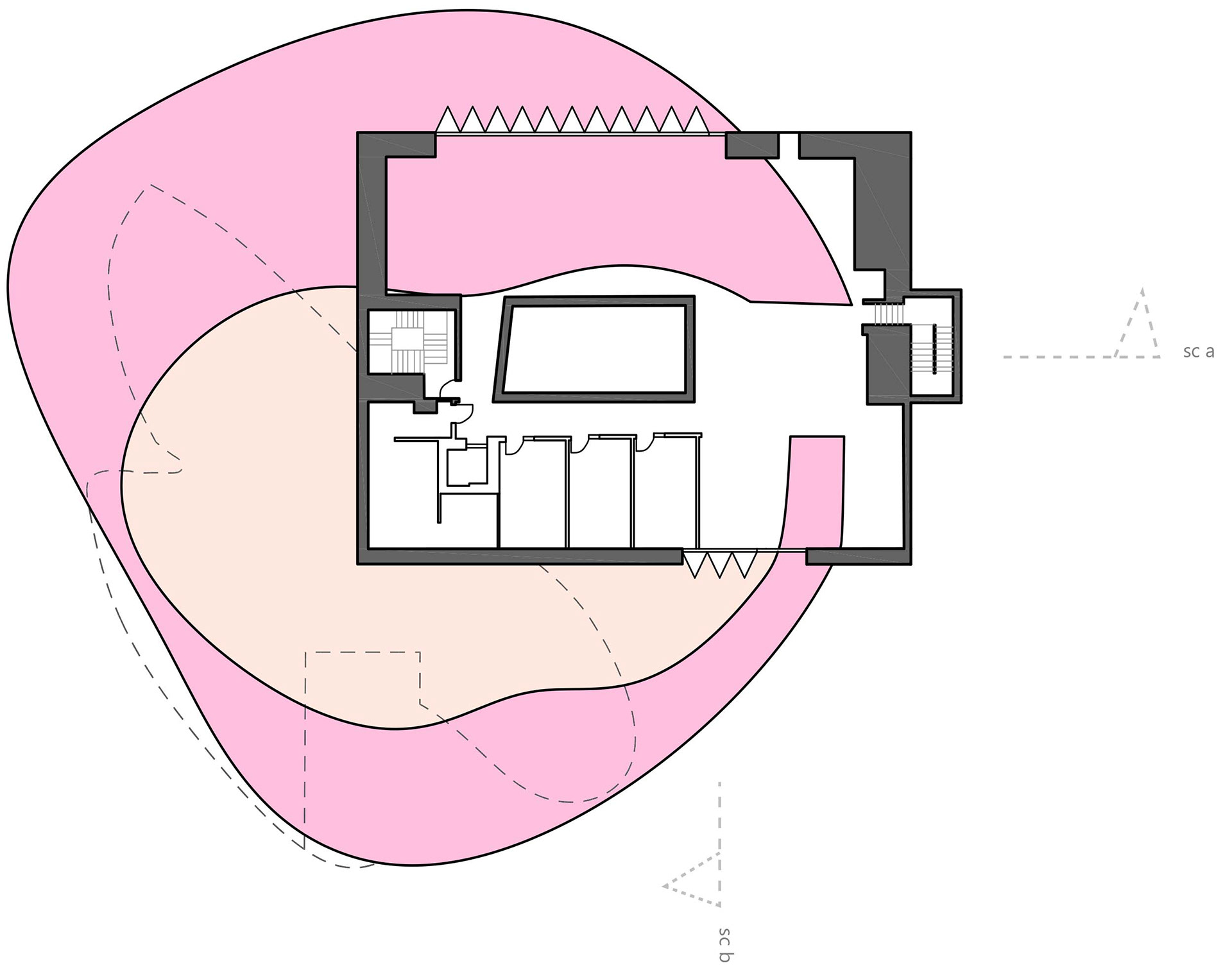

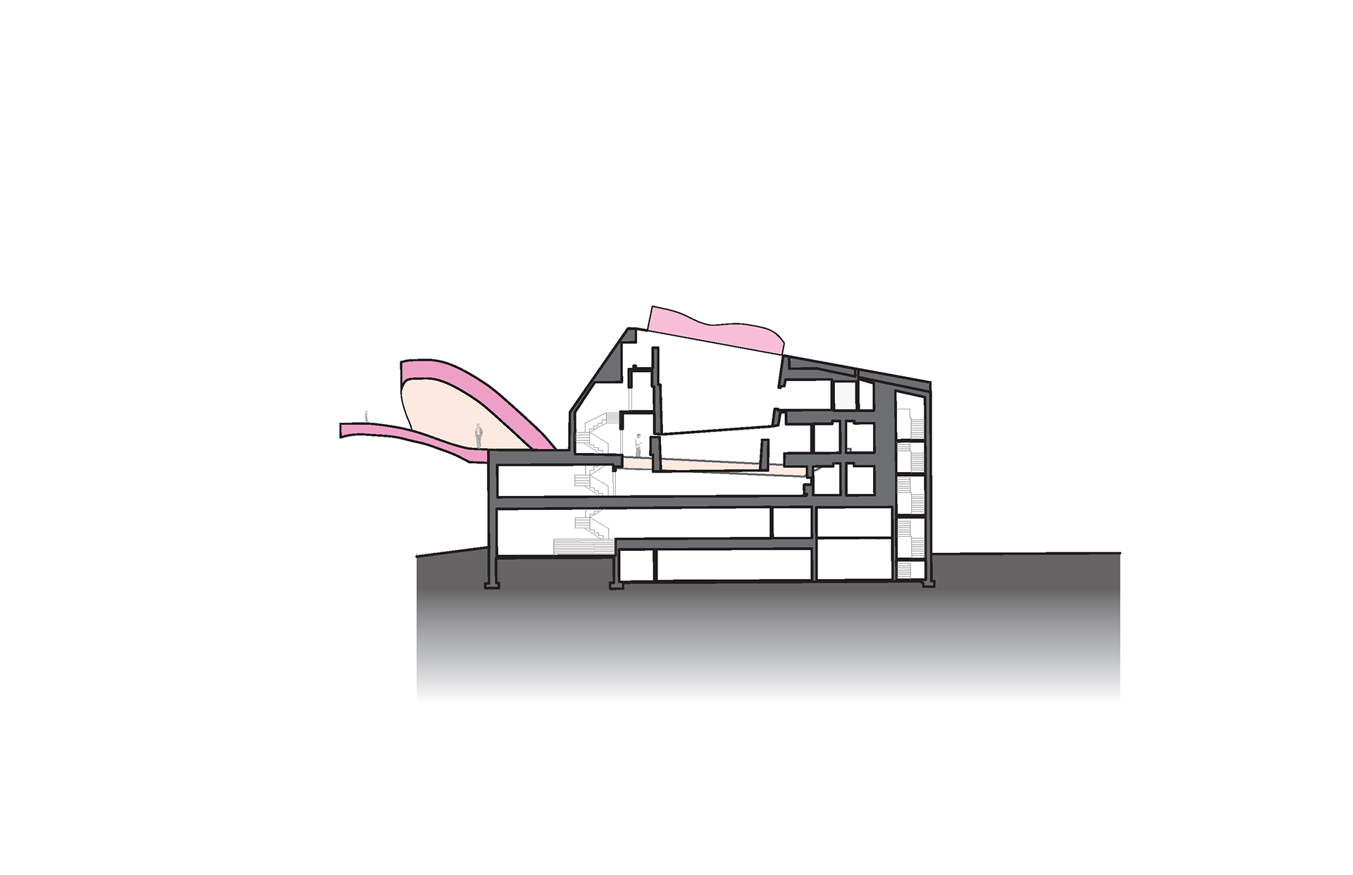
while the primary design is limited to the third floor, the circulation deck actually pierces into the second floor as well, as seen in the section cuts. this enforces the concept of the structure spilling outward. i took advantage of an exisiting rooftop, around which the deck wraps, as the location of the pavilion. as for the skylight, its curves mimic those of the pavilion; it is the building’s brains spilling upward.
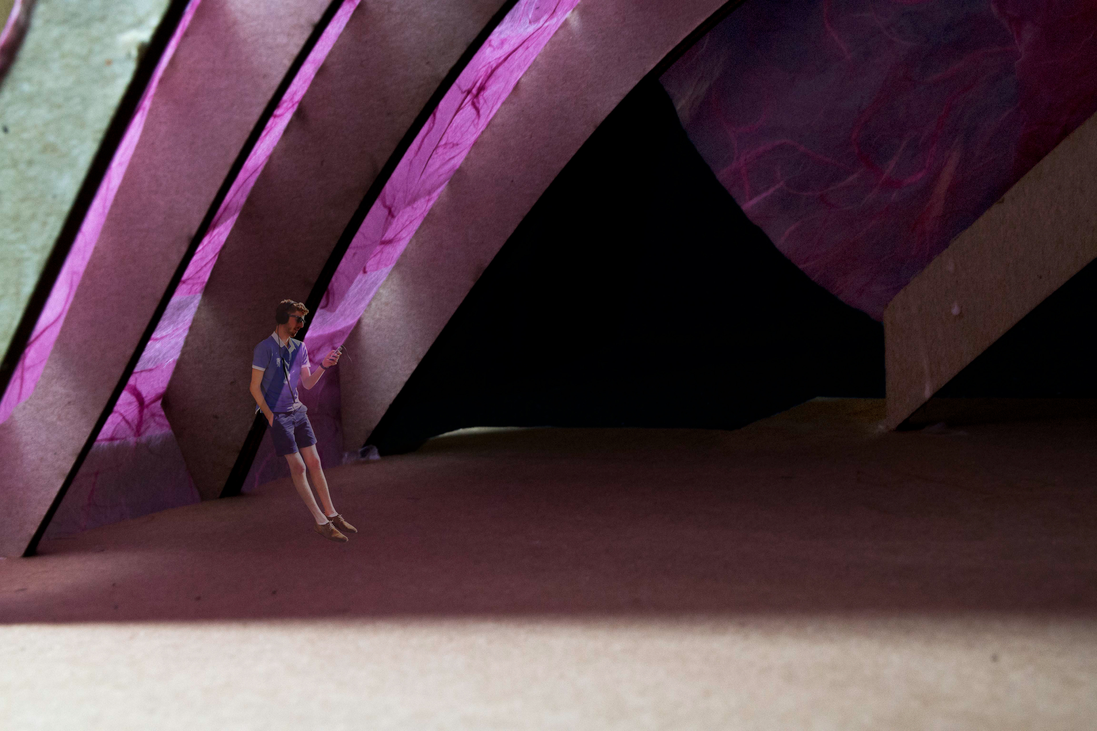
the circulation deck is not flat, but curves upward and outward. this serves to create a dynamic datum on which students can lounge and circulate between the interior and the pavilion.
while the skylight and chairs were not altered from their original shapes, the circulation deck and pavilion underwent extensive changes. firstly, the deck was reduced from a circle to a c-shape in order to maintain the interior circulation and to generate the feeling of two entrances. i wanted the wider side to become a lounge/ study space of its own, rather than merely serve as circulation.
the choice of millennial pink is another important design decision. it’s employment is two-fold. firstly, it’s fleshy tone enforces the concept of entrails spilling outward. however, millennial pink also represents a new generation of students who are pushing boundaries and evolving the way we learn. this is a new space for them, rendered in their color.
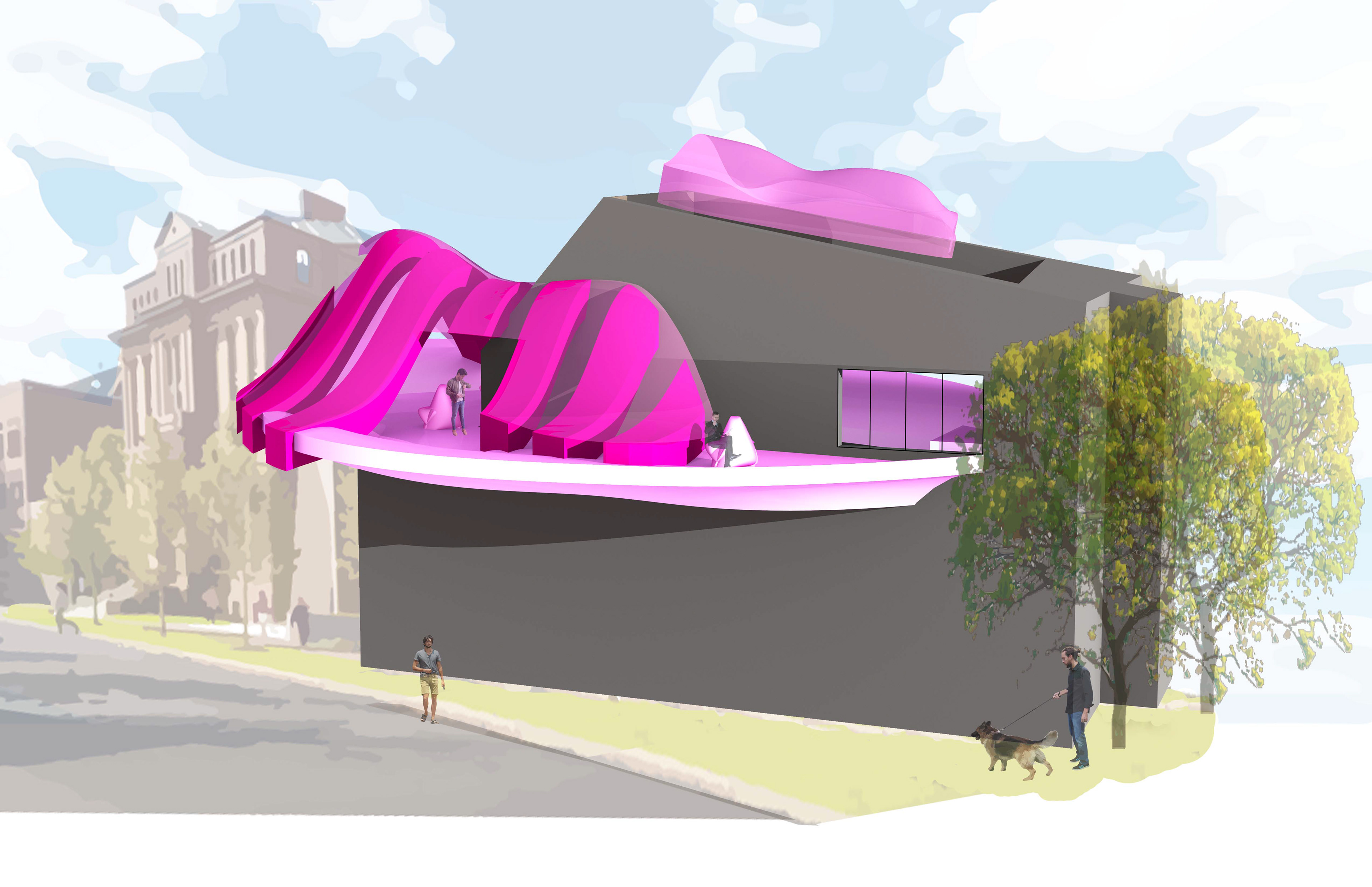


this rendering depicts the circulation deck’s dual function as a lounge/ study space in its own right. it is differentiated from the original space through is organic forms and by curving upwards out of it.
modeling
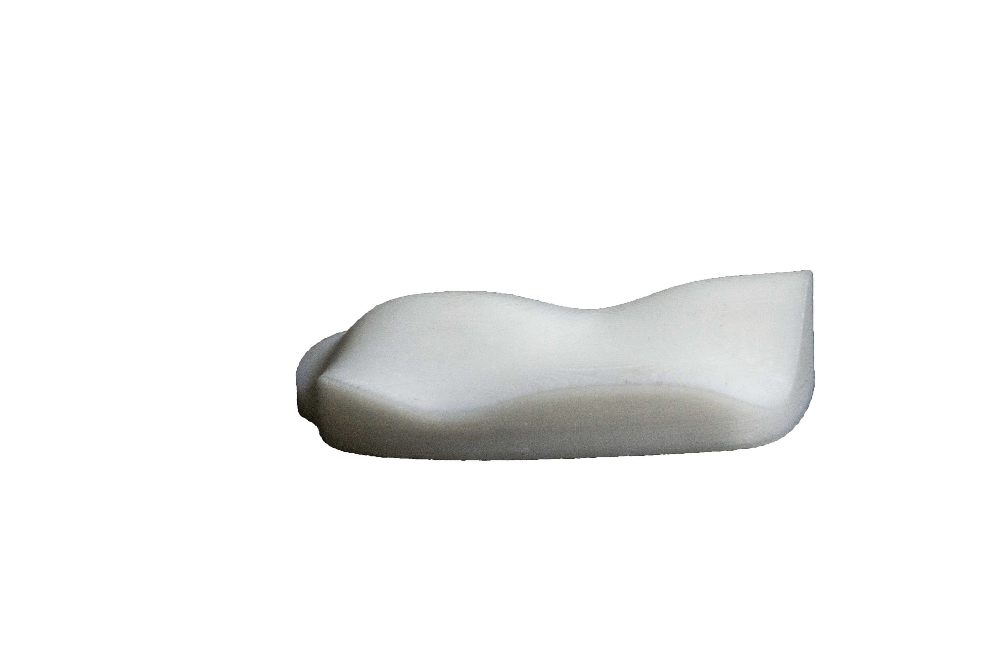
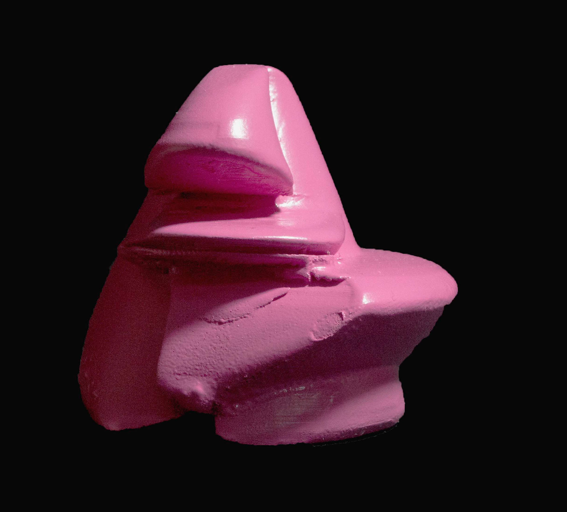
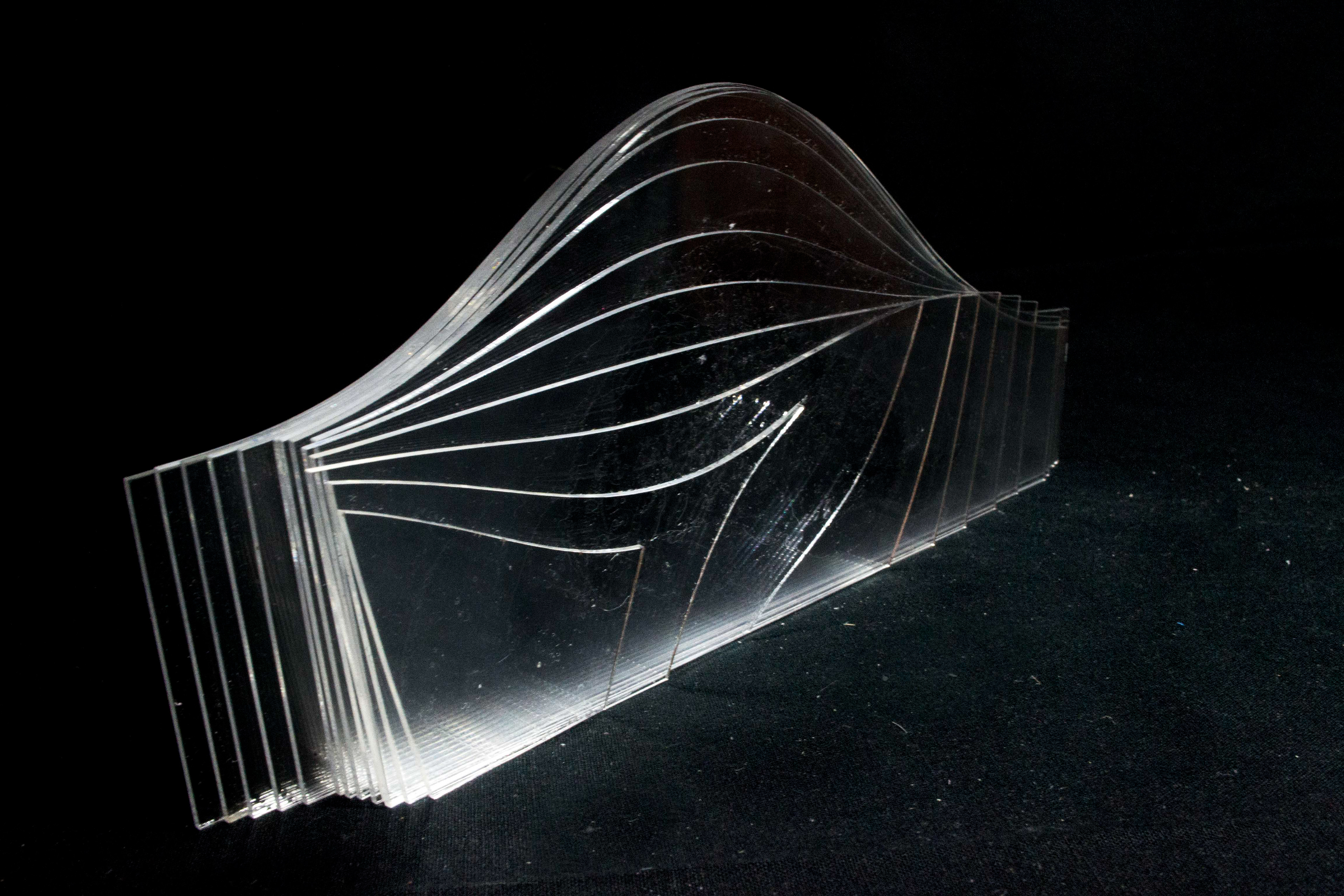
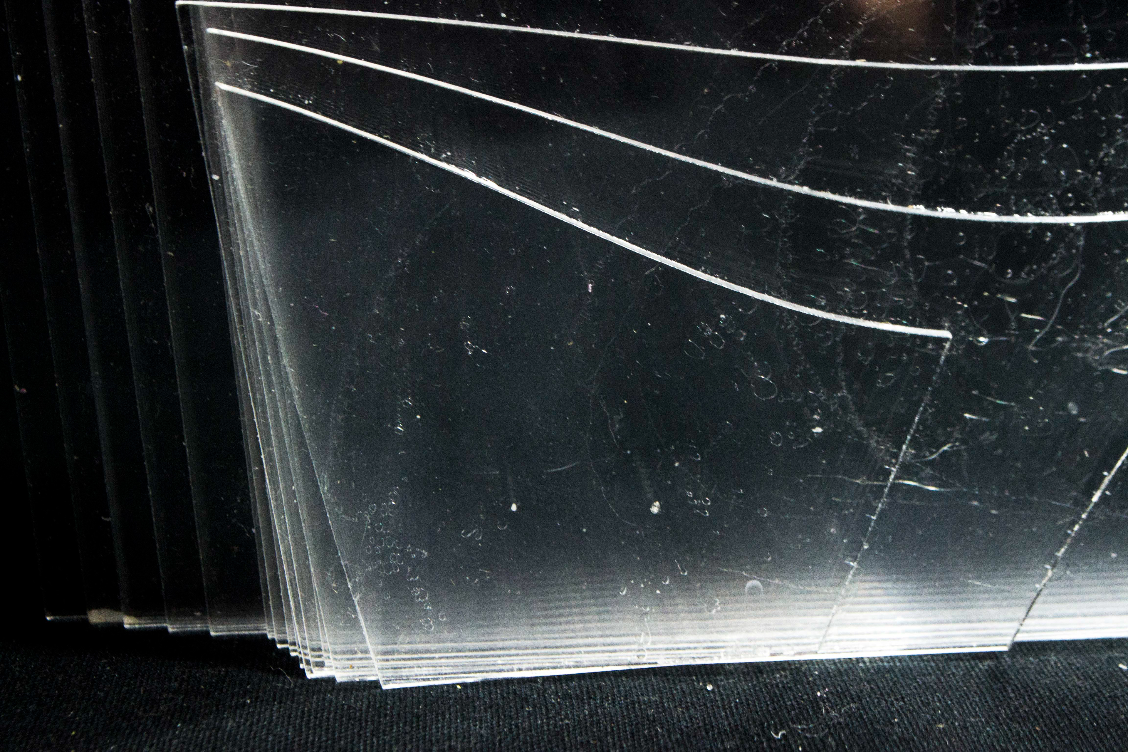
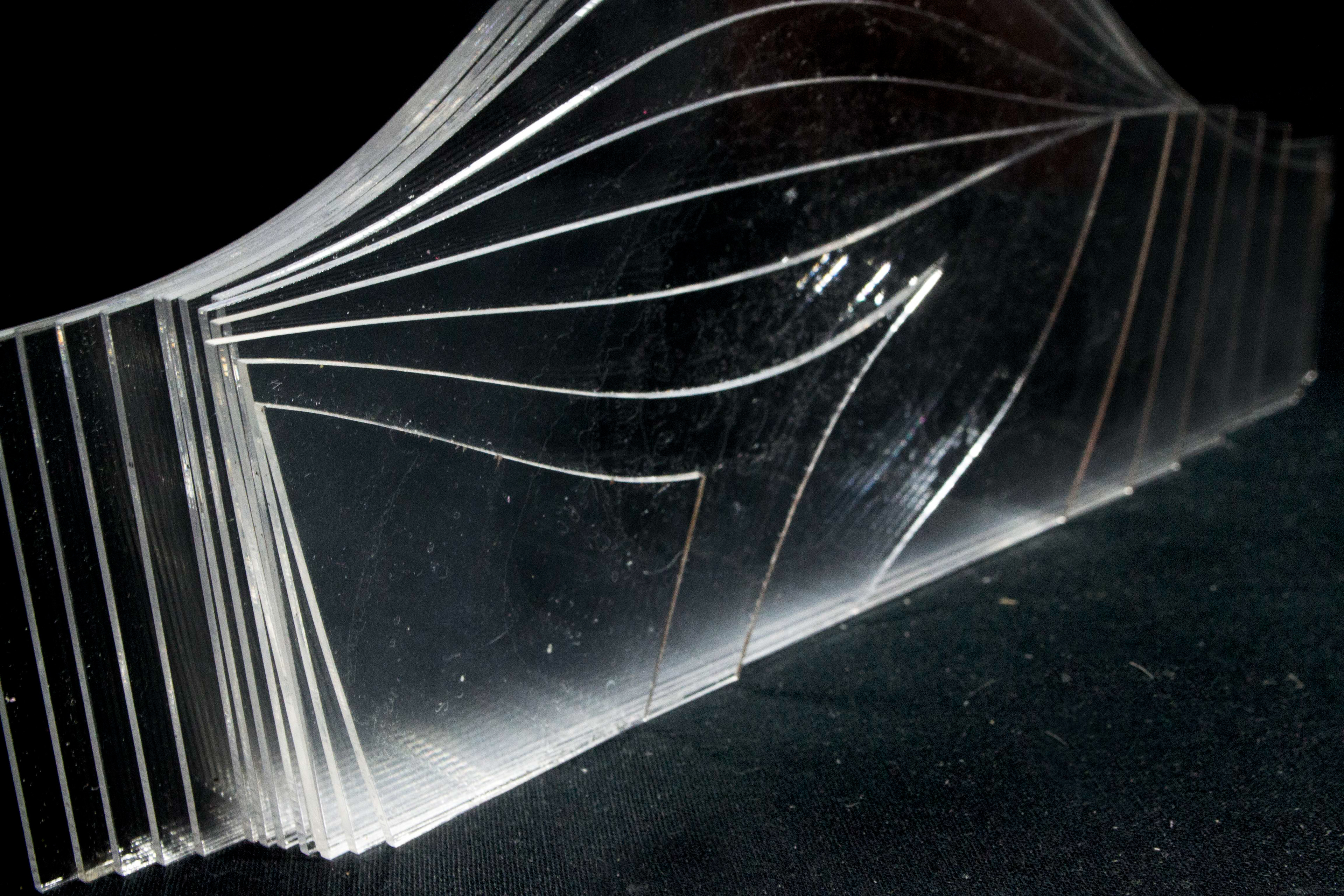
the modeling process resulted in many discoveries and design decisions. some of these decisions emerged as attempts to efficiently create models using the required technologies, such as transforming the pavilion into a series of ribs. modeling the chairs for 3D printing also resulted in an elongation of their form, to better suite printing times, but also as a response to human habitation: they had to be taller to serve as comfortable chairs. the skylight was also modeled by collating layers of acrylic that were cut from a series of section cuts. yet, the resultant shapes were surprisingly orthogonal at one end, while more organic and curvaceous at the other. this discovery reinforced the concept of the organic emerging from within the orthogonal, and so the more geometric end is placed lower, closer to the building, while the curved side is in dialogue with the pavilion.
the acrylic layered model demonstrates the skylight’s tapering shape. it evolves from an organic curving form to a pointed trapezoid.
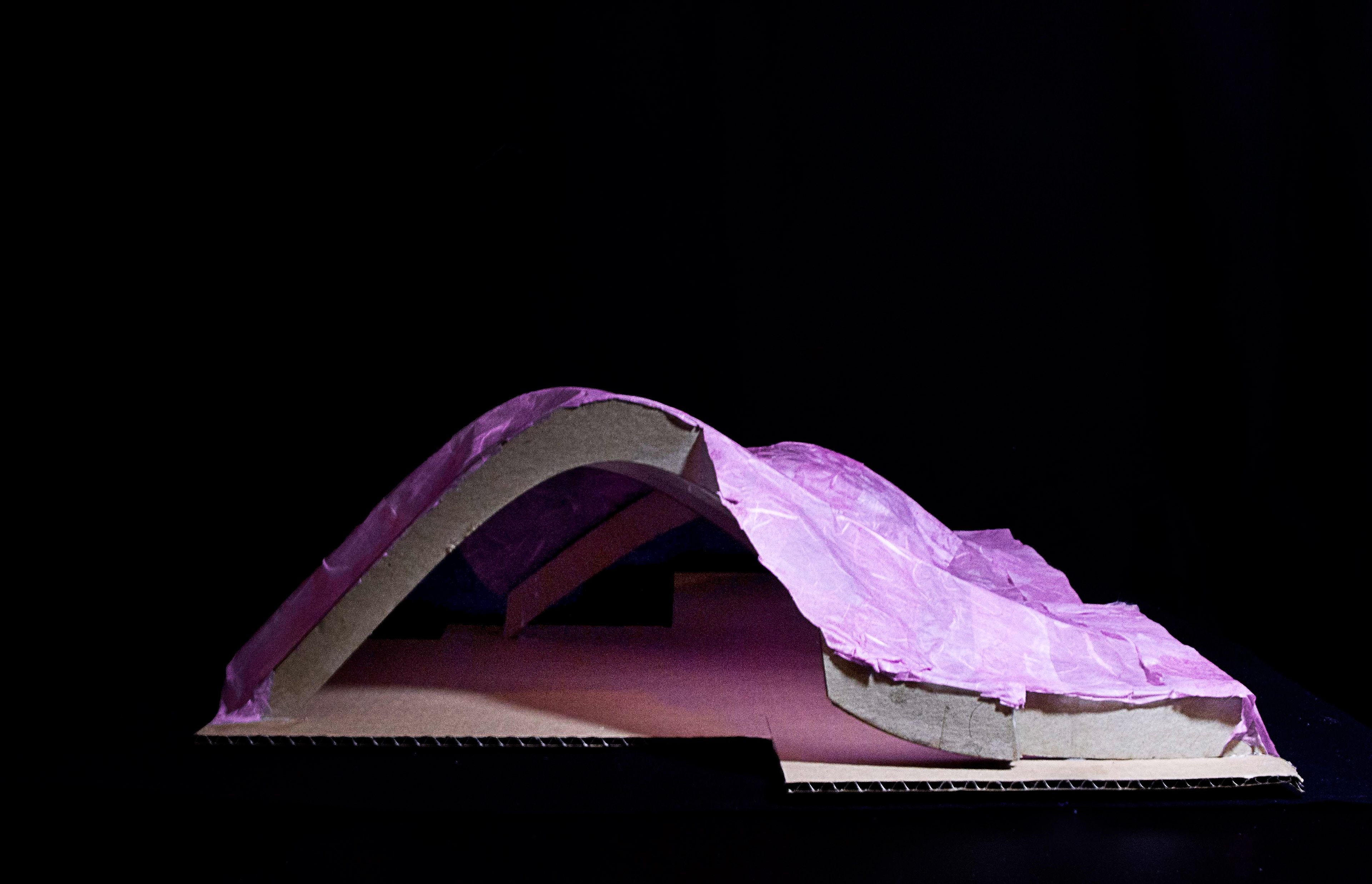
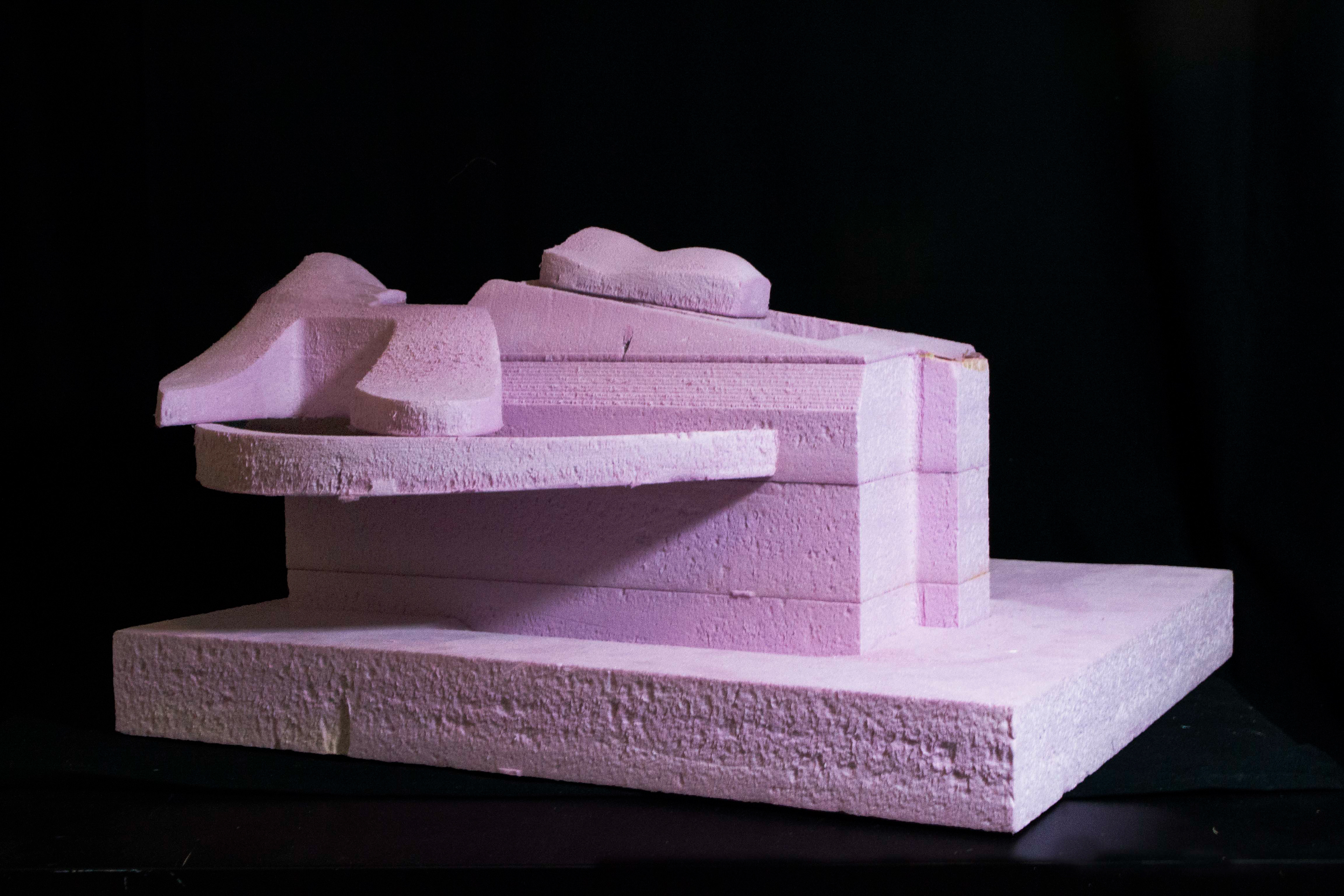
the interior of the pavilion was originally intended to be solid, however when i began to think of how i would fabricate a model of the interior, i thought of slicing it vertically into layers that i could then laser cut and stack. yet, from prior experience, i knew this would result in an almost unmanageable number of layers to collate. my resolution was to cut the pavilion into sections resembling ribs and laser cut those. then i would apply papier mâché as a coating. while not initially intended to be transparent, this modeling solution resulted in a discovery and decision to make the pavilion an airy and light-filled space.
creating this model, which was itself a solution of using less material to generate the pavilion’s form, led to transforming the pavilion from a solid mass to a series of ribs coated in a thin membrane – which is itself another reference to the entrails spilling outward. the ribs are also visible in the rendering on the first spread of this project.